In July I went with the children to a friend's place in Portugal - two mums and 4 children - the poor dads stayed back in Ireland working, though I claim that spending a week without children is a sort of holiday even if you have to go to the office 9-5 :-)
I made a quick digital layout, using Shimelle's newest kit, with a photo of one of the boys took of us:
*Digital Template: Instant Pretty Page Template by Shimelle Laine @ Two Peas in a Bucket
*Digital Papers and Embellishments: Bazinga! by Shimelle Laine@ Two Peas in a Bucket (damask paper), Delovely by Paislee Press @ Oscraps (everything else)
*Title: Wynken, Blynken and Nod by Katie Pertiet @ Designer Digitals
Tuesday, 17 August 2010
Thursday, 12 August 2010
A butterfly card
One of the beauties of digital kits is that you can change colours to suit your mood. The original butterfly in the Bazinga kit was blue, and I changed it to black and coloured it. The paper is also from the same kit - I love Bazinga.
The word art is from Nini, she has gorgeous word art kit downloadable from her blog. Thank you Nini!
*Paper and Butterfly: Bazinga! by Shimelle Laine at Two Peas in a Bucket
*Word Art: Bits of Life by Suddenly Artistic
*Punch: XCut
*Also: clear gems.
The word art is from Nini, she has gorgeous word art kit downloadable from her blog. Thank you Nini!
*Paper and Butterfly: Bazinga! by Shimelle Laine at Two Peas in a Bucket
*Word Art: Bits of Life by Suddenly Artistic
*Punch: XCut
*Also: clear gems.
Friday, 6 August 2010
Finally a card
I have been slow to craft and even slower to post since the summer holidays started.
Here's a layout I've done a few weeks ago. The layout is based on this layout/sketch from the Studio Calico blog.
* Letters: K&Co (wordgrain), Making Memories (small, black)
*Chipboard buttons:Jenni Bowlin
*Font: VT Portable Remington
*Roller Stamp: Glitz Designs
I am the sort of person who finds almost impossible to throw stuff out. It is mostly a curse, but sometimes it pays off - after I stuck the photo, title and buttons I felt something was missing in the background, but what could I do without having to rip the whole layout apart? Then I found this roller stamp which came in a kit, perfect to add a little more interest in this mostly white layout.
Celine used image transfer in one of her classes, which used a image printed with a laser printer. Since my printers are both inkjet, I had to adapt the technique. I printed the image in photo paper, applied a medium gel and transferred the pic to Bazzil cardstock. As you can see, it didn't work that well, there's a few annoying missing bits on my son's face. Later, Carrie explained to me where I went wrong. In fact she has a tutorial in her blog, so next time I'll know how to do it properly, thanks Carrie.
By the way, do you know to find something in a site using google? That's what I typed in google:
site:http://madebycaroline.blogspot.com/ image transfer tutorial
The "site:" directive makes google look for the keywords only in the site you specified ;-)
Here's a layout I've done a few weeks ago. The layout is based on this layout/sketch from the Studio Calico blog.
* Letters: K&Co (wordgrain), Making Memories (small, black)
*Chipboard buttons:Jenni Bowlin
*Font: VT Portable Remington
*Roller Stamp: Glitz Designs
I am the sort of person who finds almost impossible to throw stuff out. It is mostly a curse, but sometimes it pays off - after I stuck the photo, title and buttons I felt something was missing in the background, but what could I do without having to rip the whole layout apart? Then I found this roller stamp which came in a kit, perfect to add a little more interest in this mostly white layout.
Celine used image transfer in one of her classes, which used a image printed with a laser printer. Since my printers are both inkjet, I had to adapt the technique. I printed the image in photo paper, applied a medium gel and transferred the pic to Bazzil cardstock. As you can see, it didn't work that well, there's a few annoying missing bits on my son's face. Later, Carrie explained to me where I went wrong. In fact she has a tutorial in her blog, so next time I'll know how to do it properly, thanks Carrie.
By the way, do you know to find something in a site using google? That's what I typed in google:
The "site:" directive makes google look for the keywords only in the site you specified ;-)
Friday, 23 July 2010
Summer time and kids
Today we decided to go to Sealife in Bray. Just a - longish - trip y DART, 5 minutes walk and there we would be. I even had some Tesco tokens so the tickets wouldn't cost a cent.
There was only a little snag - my son wouldn't get inside. I tried everything, enticing "Don't you want to see Nemo?", begging "Please please", bribing "I buy you a ton of sweets", negociating "Look at the first 4 fishes and tell me if you like or not", lying "No, it is not dark in there, really". Nothing worked, he doesn't like dark places and that's it. We sat on the outside for about 30 minutes and he was going hysterical just at the idea (no, I wasn't dragging him or anything, just talking) and at the end we just had to give up. Luckily, there was also a fun fair there, but guess what, he wouldn't go in any rides either. But at least my daughter went in one and they got a teddy each in one of the stalls so it wasn't a complete waste of time.
Adding this to the typical Irish weather - and this year hasn't been too bad - maybe it is better to stay at home. I found two fun projects this evening:
Balancing Butterflies, found in Childhood Magic, via Davinie Fiero's blog.
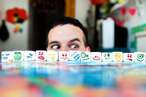
Marshmallow faces, in Color me Katie:
I am sure I saw some markers for colouring food somewhere - perhaps in Tesco's?!!!
There was only a little snag - my son wouldn't get inside. I tried everything, enticing "Don't you want to see Nemo?", begging "Please please", bribing "I buy you a ton of sweets", negociating "Look at the first 4 fishes and tell me if you like or not", lying "No, it is not dark in there, really". Nothing worked, he doesn't like dark places and that's it. We sat on the outside for about 30 minutes and he was going hysterical just at the idea (no, I wasn't dragging him or anything, just talking) and at the end we just had to give up. Luckily, there was also a fun fair there, but guess what, he wouldn't go in any rides either. But at least my daughter went in one and they got a teddy each in one of the stalls so it wasn't a complete waste of time.
Adding this to the typical Irish weather - and this year hasn't been too bad - maybe it is better to stay at home. I found two fun projects this evening:
Balancing Butterflies, found in Childhood Magic, via Davinie Fiero's blog.
Marshmallow faces, in Color me Katie:
I am sure I saw some markers for colouring food somewhere - perhaps in Tesco's?!!!
Monday, 19 July 2010
Workshop #8 - Without getting my hands dirty
Celine's workshop finished with the end of the World Cup but I am way behind. Workshop #8 had to do with using masks and mists. I am short on both, I only have one mist and not a single proper mask. Do I tried the technique using digital tools.
Playing with virtual paint is still fun, thanks to a great set of paint spray Photoshop brushes.
* Photo frame: Swank Labels by Jennifer Pebbles @ Two Peas in a Bucket
* Masks: Color by World by Rhonna Farrer @ Two Peas in a Bucket (floral), Elisa (moon and stars)
* Brushes: T9 Dirty Sprays by David Legget @ Tutorial9.net* Title letters: Bazinga! by Shimelle Laine at Two Peas in a Bucket
* Patterned Paper: You are Here by Paislee Press and The Queen of Quirk @ Oscraps (modified, barely seen)
*Font: Calibri
Playing with virtual paint is still fun, thanks to a great set of paint spray Photoshop brushes.
* Photo frame: Swank Labels by Jennifer Pebbles @ Two Peas in a Bucket
* Masks: Color by World by Rhonna Farrer @ Two Peas in a Bucket (floral), Elisa (moon and stars)
* Brushes: T9 Dirty Sprays by David Legget @ Tutorial9.net* Title letters: Bazinga! by Shimelle Laine at Two Peas in a Bucket
* Patterned Paper: You are Here by Paislee Press and The Queen of Quirk @ Oscraps (modified, barely seen)
*Font: Calibri
Friday, 16 July 2010
Ms Lazy bones
That's me. I came back from holidays feeling reenergized and ready to be creative. But somehow, I haven't done anything so far. Hopefully tomorrow... For the time being, I'll show you some of my favourite photos.
This is an oldish one, taken after the official communion photo. After my daughter came back from school, I managed to convince them to stand outside, against the house's outside wall for a photo shoot. A bit awkward, as the space is very narrow and I actually had to stand on my neighbour's front garden - but, hey, the light was good there.
My daughter persuaded his brother to smile and decided on the pose, she's the ideal photography helper - she's got much more imagination that I have.
Probably the only photo that makes me happy from our recent holiday. It turned out nice in b&w, even if the focus was in the top of the ring instead of his eyes.
One thing I would like to learn is how to find that perfect spot that has the perfect light, that makes everything, even the most ordinary thing look interesting. I know it won't be to everybody's taste (almost nobody's says you :-) ) but I like the one below.
To me, it is about the colours, the green, red and yellow and the tiny bit of blue in her nails. I love it!
This was taken in the DART. Actually the DART is a place for potencially good photos, after all there is shade inside a train and lots of light coming from all the windows. I am not mad about the green seat, but otherwise it beats any spot in my house in terms of light.
This is an oldish one, taken after the official communion photo. After my daughter came back from school, I managed to convince them to stand outside, against the house's outside wall for a photo shoot. A bit awkward, as the space is very narrow and I actually had to stand on my neighbour's front garden - but, hey, the light was good there.
My daughter persuaded his brother to smile and decided on the pose, she's the ideal photography helper - she's got much more imagination that I have.
Probably the only photo that makes me happy from our recent holiday. It turned out nice in b&w, even if the focus was in the top of the ring instead of his eyes.
One thing I would like to learn is how to find that perfect spot that has the perfect light, that makes everything, even the most ordinary thing look interesting. I know it won't be to everybody's taste (almost nobody's says you :-) ) but I like the one below.
To me, it is about the colours, the green, red and yellow and the tiny bit of blue in her nails. I love it!
This was taken in the DART. Actually the DART is a place for potencially good photos, after all there is shade inside a train and lots of light coming from all the windows. I am not mad about the green seat, but otherwise it beats any spot in my house in terms of light.
Saturday, 3 July 2010
Photography and a new kit
I've posted this photo before, it was inspired by photographers like Andrea Joki and Stephanie Lynn. They posted in the IPL forum, showing that if you look around, you can find great spots in the most common places.
I use Shimelle's new kit, Bazinga! I admit I didn't know what bazinga meant, S-J, a fellow CT member, clarified:
Bazinga - is a word you shout when you have pulled off something funny - or wild..
If you watch -The Big Bang Theory- comedy show - it is Sheldon Coopers catch phrase!

*Papers and Alpha: Bazinga! by Shimelle Laine at Two Peas in a Bucket
*Journaling Tag: Travel Journal Worksheet by Shimelle Laine at Two Peas in a Bucket
*Font: VT Portable Remington
I use Shimelle's new kit, Bazinga! I admit I didn't know what bazinga meant, S-J, a fellow CT member, clarified:
Bazinga - is a word you shout when you have pulled off something funny - or wild..
If you watch -The Big Bang Theory- comedy show - it is Sheldon Coopers catch phrase!

*Papers and Alpha: Bazinga! by Shimelle Laine at Two Peas in a Bucket
*Journaling Tag: Travel Journal Worksheet by Shimelle Laine at Two Peas in a Bucket
*Font: VT Portable Remington
Subscribe to:
Posts (Atom)