Thursday, 29 December 2011

Christmas photos and crafts


javascript:void(0)
We had a great Christmas and are still enjoying our break  - trying to do something fun everyday.

The children are delighted with their presents and so are the adults. I did buy an early present for me: RadLab, which is a photoshop plugin and very handy to edit photos.My long term aim is to take photos which need little editing, but RadLab is fun to use and can add a little something for an otherwise boring photo.

Take the photo of my son above. He was decorating a small artificial tree which was going to go in his bedroom. That how it looks in real life, taken at night with a flash.


I set the camera in manual mode, exposed for the lights. It looks a little better now.


I then cleaned a bit of the wire and played with RadLab to add a bit of glow to the photo.


I have been crafting and taking photographs, but ironically I haven't taken anIy photos of my crafty projects. I use pinterest to mark interesting things I find in the web; it a great way to have a visual catalog of them. I compiled a few Christmas projects, I'll get some photos taken but in case you want save them for next here, here are the original photos and source:


Both are relatively easy to make. The second one would be suitable for an older child. Great way to use paper scraps.


This is more time consuming, but the result is beautiful.


Made with my children and one of their friends. We used cookie cutters to make the shapes and let them colour them with markers. We didn't have much time so I let them colour before baking them. To my surprise the colours remained vivid after baking.

Wednesday, 28 December 2011

My Memories Suite Winner!!!

Back in November I posted a giveaway for My Memories Suite.

Today I finally drew a winner:

The winner is Carol, congratulations!!! Carol, I'll contact you with the details on how to win your prize.

Thanks to all that took part.

Wednesday, 7 December 2011

September Summary Layout

I am glad I finished October's summary layout and have 50% of November done. Here's September's.


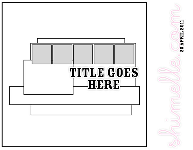
I used a sketch by Shimelle Laine.


I really helped me to get the layout done, I find hard to make original multiphoto layouts.

My home still remains mostly undecorated for Christmas,  but I put this little cuties up. They're placecards from Next. Now I need something red to complement them, anybody seen a red reindeer somewhere?

Friday, 2 December 2011

Red and White Christmas

Do you know when sometimes you get all crafty and bloggy after a long dry spell?

Well, that's me at the moment. I want to use at least a bit of my energy to get started with the Christmas decorations. We didn't do much decoration last year, but I want to put a little bit of effort this year and it is going to be all red and white. Except the tree decorations which will have all the colours of the rainbow as always.

Before  December, I always bring down a banner with little booties numbered from 1 to 24 and fill it tiny chocolate pieces for the children, our version of the advent calendar. But it was always a pain to find something small enough to fit 2 in each boot. And when I found it would always be unwrapped do I had to wrap 48 tiny bits of chocolate with tin foil. Boring! This year I decided that for this amount of trouble, I could so something crafty at least. That's what I did:


The circles are from a digi kit to which I added the numbers and punches. The little bags are sandwich bags. The original bags were too big, so I had to cut then into 4 smaller ones. Of course when I cut, I had to glue the bottom and sides again which took a while, but still I enjoyed making them.

And the photo is an entry for project 365.

Wednesday, 30 November 2011

An Apple a Day

I am behind in posting, I am in the 5th week of project 365. Here is week 3, I haven't compiled week 4 yet.

In week 3 I decided to have a theme, which  was a good idea, but I was a bit too narrow on the theme: Apples!


By the last day, I had run out of ideas. And time, as I left the photo taking for the last minutes of the day.

Tuesday, 29 November 2011

I love punches!!!

My love affair with punches started slowly, but now I have a sizeable collection. I counted them just now and if I include the tiny ones, there are 26 punches in my collection. Excluding a few mistakes (impulse buys) and one or two which are not good quality, I use them all, they're the a scrapbooker best friend.

All this to show you a layout which I made a while ago but never posted.


It is still on my wall, one of my favourite layouts of all times.
Another favourite tools/supplies in the layout:
White mist by Studio Calico.
Twine
Martha Stewart Score Board (used to make a grid pattern on the cardstock).

Sunday, 20 November 2011

Project 365

 First of all, a shout: GRÁ,  thanks for the comments, could you please email me with your address at elisamayn at yahoo dot com.

As if I didn't have enough things to catch up I started project 365. Which is to take a photo everyday for a whole year. This is an attempt to take my photography to the next level as I feel I didn't improve at all in the last 2 to 3 years.

To make it feel more manageable, I am thinking in weekly chunks, somehow taking a photo a day for a week (for 52 weeks) doesn't seem as daunting.

I just finished my 3rd week but I haven't uploaded all the photos yet, here are my first 2 weeks.

Two days to get used to the whole idea, 29/10 to 30/10

First week 30/10 to 06/11, some taken at home, some taken in Westport. Photos were really boring so I inverted the colours of a couple of images and run an action in another. Cheating I know.  2 Chandeliers, 2 ceiling lights.


Week 2 07/11 to 13/11. I had the worst flu in years but still managed to take a photo a day. Last one is my son's bike in the porch seen from indoors.

Saturday, 19 November 2011

Back into Craftland and freebie giveaway continued.

A couple posts ago I offered some Halloween scrapbooking stash, and the winner  :-)  is Grá, I didn't have to have a draw for this one. Grá, please contact me at elisamayn at yahoo dot com with your address so I can post you the stash!

My another giveway is My Memories Suite which I posted here. It is a fabulous prize and I'll wait a little bit more to announce the winner. Put a comment in the original post to have a chance!

Here's another digi I made with My Memories Suite, using a ready made template, I only changed the title of the layout. It traces the change in my daughter's outfit from the last 3 Halloween nights. She wanted to be scary and  she chose her outfit; a vampire; and I let her do her own make up. I have to admit it was a little bit too creepy for me, but she was happy.


As for paper and glue, I am also making some Christmas stuff, some cards like this one:


I'll post my remaining cards in my other blog next week.

Have a great weekend!

Sunday, 6 November 2011

Digital Scrapbooking Software Giveaway!!!

Happy Digital Scrapbooking Day!

I have a great and fitting giveaway for Digital Scrapbooking Day; a fabulous sofware called My Memories Suite!

A few weeks ago, I was asked to review it and give a copy to one of my readers.  As a hybrid scrapper; that is one that like to use digital elements to real life pages; I jumped at the opportunity. 

My background is in IT, so I think that sofware should be easy to use so I just started using as soon as I installed it. I was amazed on how easy it is was to create a whole album from scratch. There are tons of templates; with styles to suit all tastes.

My own style veers towards clean and simple; so I choose one of the simplest ones - but there are lots of quirk and colourful ones too. One that caught my eye was the baby one; I think I might have to make one for a friend who had a baby girl recently.

One thing that My Memories Suite have to accomplished is to have ways to create an album very quickly while at the same time allowing you to have as much control as you want. In one hand you can create a 30+ page album in one step and upload all your photos in another step.  Or alternatively; you can pick each page style one by one; or even create your own style. And choose which photos go where by using the drag and drop.

Because I didn't read the online manual it took me a while to find out how modify each photo (eventually most of the things I wanted were in crop and effect tools). Under effects I found a few basic tools like making the photo lighter; darker; black&white; etc. Crop  allowed me to move a photo within the frame. The think I missed was how to resize the photo while keeping the frame intact.

There are a number of background papers, embellishments to choose from, as well as a big array of text effects available. However, since I already have a great amount of digital papers and elements, I wanted to know if I could use them. The answers was YES. There's probably other ways to do it, but the easiest I could find was to upload them as photos.

This is a quick album I created this evening - I used a pre-designed album in My Memories Suite and used the option to add the photos automatically. My only design choice was to add a few doodles and word art by Karla Dudley which I had already in my laptop. And then I exported in movie format which I am sharing with you. Easy peasy!


There's more cool features which I didn't review here, like the ways you can make your album interactive. I think an album in a DVD would make a great Christmas present for the family. I am envisaging adding a Christmas message from my children to their grandparents. Maybe I could record them singing a Christmas carol and add it to the album too?

This is my evaluation of the software:

PROS: This is a great software to make an album with interactive features or a quick traditional album to be shared online or to be printed.
It is easy to use and flexible.

CONS: Not many, but it is bulky and takes a while to install and to run the first time.  Some features, like ordering a calendar are only available to US and Canada customers.

I am pleased to say I was given a Share the Memories code that provides a $10 discount off the purchase of the My Memories Suite Scrapbook software and a $10 coupon for the MyMemories.com store - $20 value!). The code is STMMMS32678.

My Memories website also has digital scrapbooking kits, which of course can be used on its own or with My Memories Suite. If you'd like to put your name in the hat for a chance to win My Memories Suite; leave a comment telling me which is your favourite Christmas kit from My Memories.

Monday, 31 October 2011

A Little Halloween Treat

Happy Halloween!!!!

I have a few bits  and pieces of Doodlebug's Spook Town collection to give away.


If you are interested, please leave a comment here and I'll get a name out of a hat next Sunday.

And come back, as I'll have a very exciting giveaway soon ;-)

Monday, 17 October 2011

Looking for inspiration

 I am guilty on saving pages of magazines, bookmarking, pinteresting lots of inspirational ideas and not using them effectively.

To combat this, sometimes I am deliberately using a sketch, photo or a design as the starting point for a layout. Sometimes it works, sometimes it doesn't.


Michelle La Grue found this sketch by Becky Fleck:


I strayed from the sketch, but still you can see where I found the inspiration:


And this cute shoe (by JoyFolie) I found in Pinterest:


what the inspiration for this layout:

I used everything this time, the colour palette, the stripes, the orange and white round shapes.

Wednesday, 5 October 2011

A quick mini book

Last month I posted a flag book. The spine of the flag book is a concertina to which you attach paper strips and it got me thinking that I could make a mini book that way. I was almost sure that I had seen something like that before but couldn't find the source.

After I finished mine, I saw a beautiful one by Michelle La Grue, but you have to take my word for it, I took  a quick look and can't see it in her blog.

Summer last year I took the kids to the city centre to buy a tweed cap for my Dad (more of it later). Since we had the whole day, I decided to bring them to visit the National Gallery, the National History Museum, with a stop for lunch in the Kilkenny Design Centre and some fun in the ]Merrion Square playground.

Of course I took my camera  and I planned a mini album based on the trip. It was all the be designed digitally and printed in 6x4 photo paper. One thing about me though, it that I loose steam pretty quickly. If I don't finish something say a week or so, I get bored and start to do something else. Which is what happened.

Last month, I was sorting out my stuff when I came across the printed pages. Then I remembered the idea to make a concertina-based (must find out the proper name for it) mini book and it all came together quickly.


The cover is acetate - I stuck the title there. The spine is held together with Studio Calico fabrips and coloured bias tape (by Lily). The page that you can see through was done digitally; the photo, the border, the background and the sellotape are all digital elements put together in PSE.

And there some of the pages:


I can't resist a colourful wall. And colourful umbrellas.

 Mosaic floor in the National Gallery


 My son modelling the cap.


The journaling is too small to read and way too long also so I'll give you the short version:

My Dad asked me to buy him a tweed cap for him. I told him it was made of wool and unsuitable for where he lives (Brazil). He insisted it was made of cotton because he read it somewhere that it was cotton. No, he wouldn't trust his daughter who lives in Ireland nor his son-in-law who is Irish. So eventually I bought him a tweed cap knowing very well that it would never be used.

*Patterned Paper: scraps from Basic Grey, 7gypsies and October Afternoon among others.
*Digital elements: You are here by Paislee Press and Queen of Quirk,  among others.
*Other: Studio Calico Fabrips, bias tape

Sunday, 25 September 2011

Digital layout

This is something I have meaning to do for ages, a photo collage. It's been in the back of my mind since I saw a digital template by Paislee Press a while ago. Then there was this amazing layout by Susan Weinroth.

Finally, after a few false starts, I decided to spend a couple of nights selecting the photos and then adding to the template. They are all photos of my two kiddies taken in 2010 and they are the opening for that year in my project 12 album.

Thank you Liz Tamanaha (a.k.a. Paislee Press). Without her freebie I don't think I would have ever finished this project. Can you imagine resizing and cutting 74 tiny photos?!

I printed the template 10x10 and stuck it into patterned paper but with hindsight I should have done all digitally, I love this zigzag paper which belongs to the same kit as the butterflies.


* Digital Template: Press Plate No. 25 by Paislee Press @ Oscraps.com
* Photoshop actions: Falling for b&w by My Four Hens 
* Background paper (resized), butterfly and word art:  Twenty Twenty by Karla Dudley @ Design House Digital
* Font: Century Gothic

Wednesday, 7 September 2011

A Flag Book

I've been meaning to try to make a flag book for ages - first I thought it was too difficult, until I read a tutorial and discovered that the making wasn't hard, it was more a matter of deciding what to put inside to make an impact. A bit like making a never ending card.

Finally I decided to bite the bullet and make a test one. I could have crafted it a little bit better but it didn't work out that bad, but definitely the image choice - a photo I took in Rio and photoshopped - lacked impact.

Since it was my brother's birthday yesterday and  I sent it to him last week instead of a proper birthday card, so it wasn't totally useless.

The cover - I am happy with it; it's a family photo that my husband took.


Inside, the flag book itself:

The back:


The "spine" of the book is a concertina to which you attach paper strips; when you open the book and pull the concertina, the paper strips overlap creating a moisac-like image with repeating patterns.

If you do try to make one, choose your image carefully, mine was pretty but boring with too much white space and lacking a strong focal point.

I am definitely going to have another go, but next time, instead of a photo, I'll use random bits of paper. 

Monday, 29 August 2011

Trying new food

While I haven't been completely idle as far as idle as craft is concerned, I haven't taken any photos of what I have managed so far. So I'll change the subject. To food.

Sometime ago I set a goal to try to make a new dish every week.

Why? Because I had fallen into the routine of cooking the same dozen or so dishes that everybody at home liked. Specially after my number two turned out to be a very fussy eater. Or else, cooking something for my husband and I and popping chicken nuggets and chips in the oven for the kids.

I have kept the goal - with a little bit of cheating - but I can't remember exactly what I made and when I made, so my next project is to have a folder with the recipes printed so I can go back to the ones that were sucessful.

The recipes I found in the internet I saved in Pinterest so I can list here, click on the link for a comment and a link the original post/recipe: