Sunday 29 March 2009

My boy's fashion sense, my flower girl

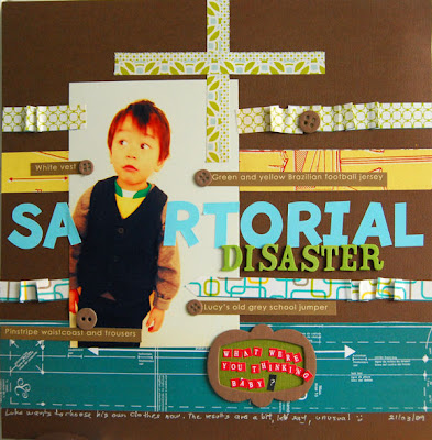
My son just started now to choose his own clothes and he's very adamant on what he wants. This is what he was wearing last Sunday.


Apologies for the misuse of the word sartorial, but I liked the sound of it, and besides he is wearing pinstripe waistcoat & trousers, isn't he?

The second layout of about my daughter, she was the flower girl for my sister-in-law and her fiancee's wedding.
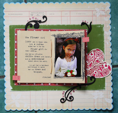


I was inspired by a challenge set by Lisa (scroll down to the last inpiration). The challenge was just the push I needed, thanks Lisa!


The layout was made like a real 4 page book, so if you turn to the front page you will see the original invite.
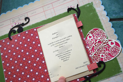


The last page will have photos of the happy couple. The heart on the right was cut out from their invite too.

Reply to a query and a scrapbook page display idea

Reply: Evonne asked how I made the flower in the previous post. I can't remember where I saw it originally but here's another tutorial.

Two differences from what she did, I started my flower from the outside strip pf the spiral - that became the centre of the flower. Neither I did any pinching, just pushed the flower in shape as I went along. I also inked the edges white.

Display: My routine used to be: finish scrapbook page, take a photo, blog it, show to DH and children if I thought it would interest them and off to the album.

I began to feel sorry for the poor things, such a short time in the limelight, I the lightbulb came when I saw some 13"x13" canvas in Easons.

I attached a page protector to the centre of the canvas and secured it 2 white brads (one in each hole of the page protector).

When displayed on the wall, the side with brads goes in the top and the page protector becomes "side-loading" (which means the brads on their own should secure the page in place - I put some double sided tape at the back just in case).

It is simple and easy to replace LOs, so everytime I finish a LO, I replace the previous one. I have two canvases in my scraproom and recently bought another 3 going cheap in Homebase. My plan is to have something similar in the kitchen - the page protector should keep it from getting grubby and if it does, it is easily replaceable.

Friday 27 March 2009

PaperPlay - Creating your own background (and faux stitching)

This week's PaperPlay Challenge was set by Jackie:

" It's all in the background " so for this challenge I want you to create your own background papers using rubber stamps, chalks, inks, whatever you like, but NO patterned papers, you can use plain papers too and any embellishments you like as long as there is a handmade pattern clearly visible somewhere"

It was great fun, I tried something I saw somewhere (probably Tim Holtz's blog).

I first stamped the script with black stazon, then stamped the swirls with Versamark and embossed with clear embossing powder. Then I covered 3/4 of the paper with pink acrylic paint. When the paint was almost dry, I rubbed baby wipe over it, revealing the bits which were embossed.


My intention was to stitch around the photo and leaves, but my sewing machine is dead (hopefully a change of fuse is all it needs), so I was stuck until I remembered a technique in the CK magazine: use a paper piercer to prick holes at regular intervals, and then with a white gel pen connect the dots.

It is very convincing, even looking at the "stitching" in real life, you have to get real close to realise it's fake.

Wednesday 25 March 2009

Seven

I still haven't done a page for my children's birthday last year, so I decide to not let this year's take too long.

It is very similar to another layout I made recently, down to the same gorgeous Studio Calico paper.

Saturday 21 March 2009

1 boy 45 minutes 2 shop assistants 100's outtakes 1 photo

My daughter was off school that day, so we decided to go to the zoo. On the way, we stopped to take a passport photo of my son. Well,it took so long, we nearly didn't make to the zoo.


Shop assistant 1: - Luke, please stand still, and look at the camera.
He does that and grins to the camera.
- Don't smile. (Guidelines for Irish passport photos says subject shouldn't smile).
He frowns.
- Don't frown!
His face loosens up and his jaw drops.
- Please close your mouth.
He purses his lips. Shop assistant 1 begins to look weary.
- OK, now look at the camera.
He does, chin stuck to his neck.
- Chin up!
He looks straight up to the ceiling.
- No, down.
He looks at his shoes.
- Here, look at my hand. (I say, as I raise my hand to the right height).
He raises his own hand.
-Noo, hands down.
He crosses his arms.
- No, arms straight!
He does that, and look sideways.

And so it goes, until shop assistant 1 call more experienced shop assistant 2. And story repeats itself.

At this point, I am trying my best not to laugh hysterically but the other two, while very pacient, don't seem to see the funny side.

The final result? One lousy passport photo.


He was a troupper, 45 minutes with 3 women shouting instructions to him and he didn't loose his pacience!

Did this one at Crafteire, Eva's class:


Davinie, has a challenge in Studio Calico to do a layout for every month of 2009, every month one should scrap the previous one. Being me, not only I started late but decided to start with Dec 08, a non photo LO, inspired by Ali Edward's one using only Christmas cards. It is still very special because the poem was co-written by our friend Mark (aged 9) for the Christmas card in his school, and the candle was drawn by my daughter for the Christmas card of her class. A great was to raise funds for school, who wouldn't buy a card that features their son/daughter's drawing?


I'll try to get to Jan/Feb now.

Wednesday 11 March 2009

A texture tutorial

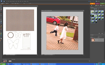
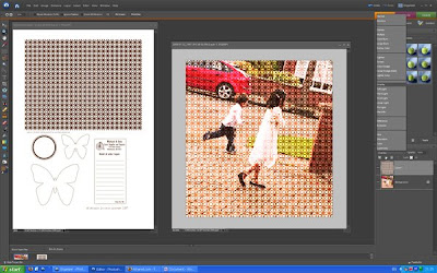
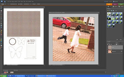
When I posted my Butterfly layout, I got a couple of inquiries on how I merged Kirsty's texture to the photo, so here's a tutorial, I hope it helps.

1. Start PSE and open your photo and Kirsty's page.
2. Use the rectangular marquee tool to select the texture from Kirsty's page.

When I posted my Butterfly layout in the SC gallery, I got a couple of inquiries on how I added the texture to the photos, so I made a quick tutorial, I hope it helps.


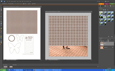
3. Press Ctrl-c to copy the selection. Copy the selection into your photo (Ctrl-v)


4. As the texture is not big enough to cover the photo, copy the texture again and use the move tool to cover the missing area.


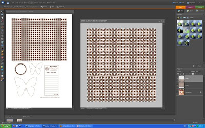
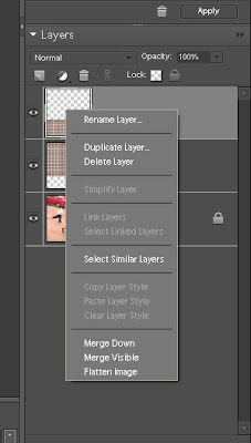
5. In the layer pallete, right click on the top layer and select Merge Down.


6. Now the fun bit, see where it says Normal in the layers palette? Open the drop down menu and select Overlay.


7. Move the opacity slider (I used 30% here).


8. Use the eraser tool to remove the texture from face, arms and legs.


I hope it helps, thanks for asking.

Textures are big, many photographers are adicted to it, here's the article that started for me.

Tuesday 10 March 2009

Fun with photos & a self portrait

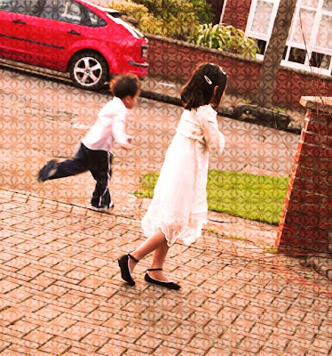
The talented Kirsty Wiseman created a digital printout for the Studio Calico blog, which inspired me to change this photo, which I like because of the movement of the children but which had an uninteresting and busy background.


I overlayed the pattern and the butterfly with the original photo and got this. One of my favourite layouts at the moment.


Thanks Kirsty!

When my daughter came home from school with this self portrait, my husband & I smiled at each other, as to say "so that's how she sees herself". The portrait is accurate enough, but if you look at it on its own, you'll probably guess that the subject has her roots in Africa instead of Asia. But with her cafe-au-lait skin tone (the photo is too bright as I overcompensated for taking the photo in a dark spot of the house), wide nose and full lips it's easy to get mistaken.

Monday 2 March 2009

HSM for boys

My 3-year-old son, influenced by his older sister, is a big fan of High School Musical. Last time I bought my daughter a HSM-themed T-shirt, my son cried because he so wanted one too.

Sadly I couldn't find any HSM clothing suitable for boys, there's some Wild Cats T-shirts, but my non-literate boy only recognizes the HSM logos so it's of no use for him. So I promised that I would make a T-shirt for him myself.

I printed a HSM-lookalike logo onto T-shirt transfer paper and then ironed the paper into a white T-shirt.

Here's the final result.


The main font is Budmo Jiggler, the cursive font is Susie's Hand.

Here's another one, I am just waiting to get a another white T.


I suspect the original font is Helvetica, I used Arial Black.